M2TOIT: Brand Identity and Full Webflow Website
For a roofing company, trust is earned before the first interaction. When a homeowner discovers a leak, displaced tiles, or moss growing on their roof, they look for a professional who is serious, responsive, and reassuring. The entire challenge of this project lay in translating that seriousness into a brand and a webpage capable of transforming a concern into a quote request.
M2TOIT is a roofing company with 20 years of experience, specializing in moss removal, cleaning, repair, and renovation of roofs. They operate across Vienne, Indre-et-Loire, and Deux-Sèvres, throughout Nouvelle-Aquitaine. At launch, the company had no existing brand image: no visual identity, no website, no digital presence. I took charge of the project from start to finish, from brand strategy to launching a landing page designed for a Google Ads campaign.
The Challenge: Inspire Trust and Generate Quotes
From the outset, three priorities emerged:
1. Establish credibility for a company still invisible online
Without a brand or website, M2TOIT had no way to reassure a prospect before a call. It needed an image that matched its expertise, one that was immediately professional.
2. Convert paid traffic into qualified leads
The page needed to be designed for a visitor coming from Google Ads: someone with strong intent, little patience, and a quick decision to make.
3. Build a scalable brand foundation
The identity and design system needed to be extensible to a full website later, without starting from scratch.
Building the Brand from Scratch
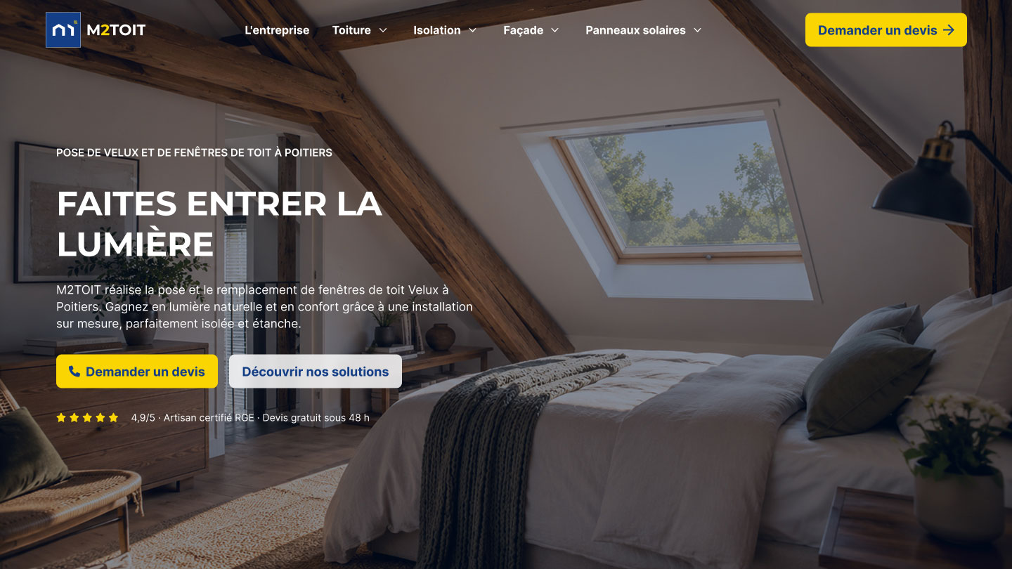
Before touching the page design, I created the entire brand identity, starting with the logo. I designed a geometric monogram inspired by the shape of a roof, punctuated with a yellow accent, paired with the name "M2TOIT" in a strong and legible typeface. The logo was built to stay recognizable everywhere: on light or dark backgrounds, from a favicon to utility vehicle branding, business cards, and administrative documents. A tagline anchors the positioning: "Expertise that measures up."
An Art Direction Focused on Conversion
Every visual choice was made with a simple goal: inspire trust and guide users toward action. The palette is built on a deep navy blue, conveying seriousness and reliability, two qualities that matter when a homeowner is entrusting their roof to a tradesperson. A bright yellow brings it to life, used exclusively as a signal color: it draws the eye to buttons, badges, and key points, without ever dominating the layout.
Bold, all-caps Montserrat gives titles an assertive and direct tone, balanced by Inter for body text, which is softer and more comfortable to read. The full system was formalized in a comprehensive brand guide (logo, colors, typography, usage rules), ensuring perfect consistency across every medium, online and offline.
Designing a Persuasive Landing Page
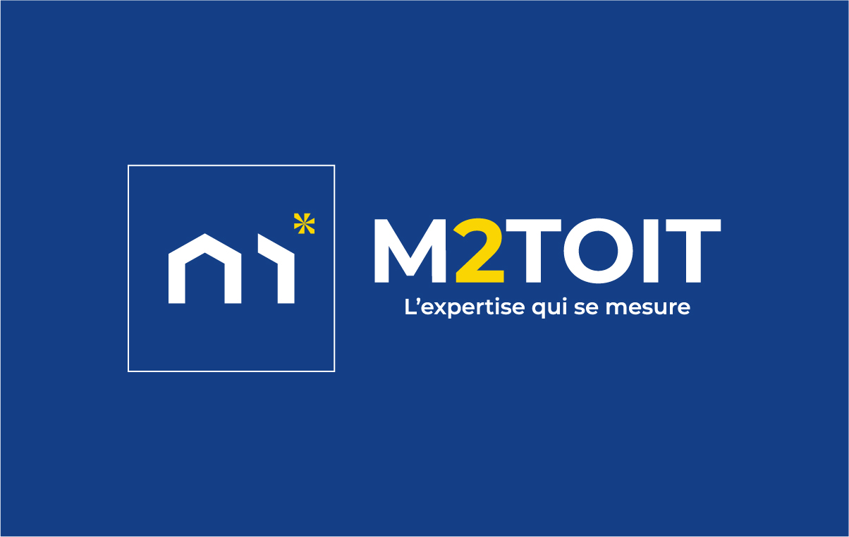
The design process followed a structured approach: zoning, wireframing, then high-fidelity design in Figma. I didn't treat the page as a simple showcase, but as a persuasive journey where each section addresses a specific stage in the visitor's decision-making process.
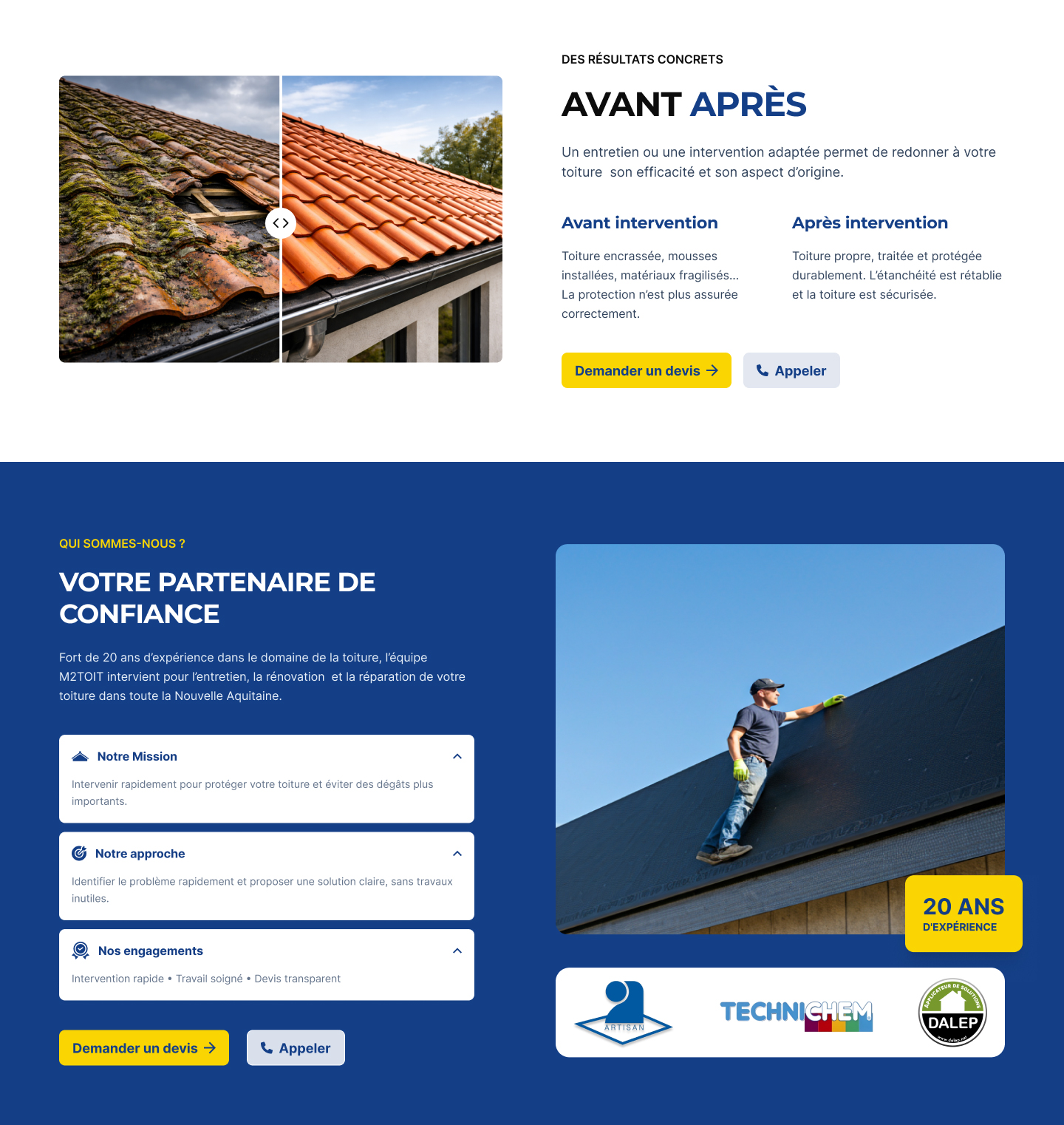
The hero section immediately addresses the roofing problem and offers an instant call to action: request a quote or call. This is followed by a "causes" section that names the situations visitors actually experience (moss, grime, damaged tiles, leaks), building recognition before presenting the services. The before-and-after visual makes the result tangible, the company block with its 20 years of experience builds legitimacy, and customer testimonials lock in trust just before the decision point.
Developing on Webflow
The design was fully developed on Webflow, delivering a responsive, fast, and easily maintainable page. Particular attention was paid to mobile, where the majority of local ad traffic lands. The quote request form was implemented with all the essential fields (first name, last name, phone, postal code, message) and GDPR consent, capturing leads without friction while staying compliant.
Optimizing for Google Ads Traffic
The entire page was built around a single objective: getting a quote. The form sits at the top of the page to immediately capture the warmest visitors from ads, and the calls to action ("Request a Quote" and "Call") repeat at every scroll stage to keep the user focused on conversion. In parallel, reassurance cues (free quote, no commitment, personalized diagnosis, fast response, 20 years of experience) address decision barriers one by one.
The Result
A consistent, professional, and entirely conversion-focused landing page, backed by a custom brand identity and launched to support a Google Ads acquisition campaign. In a single project, M2TOIT went from zero digital presence to a lead generation tool ready to deliver qualified quote requests.
From Landing Page to Full Website
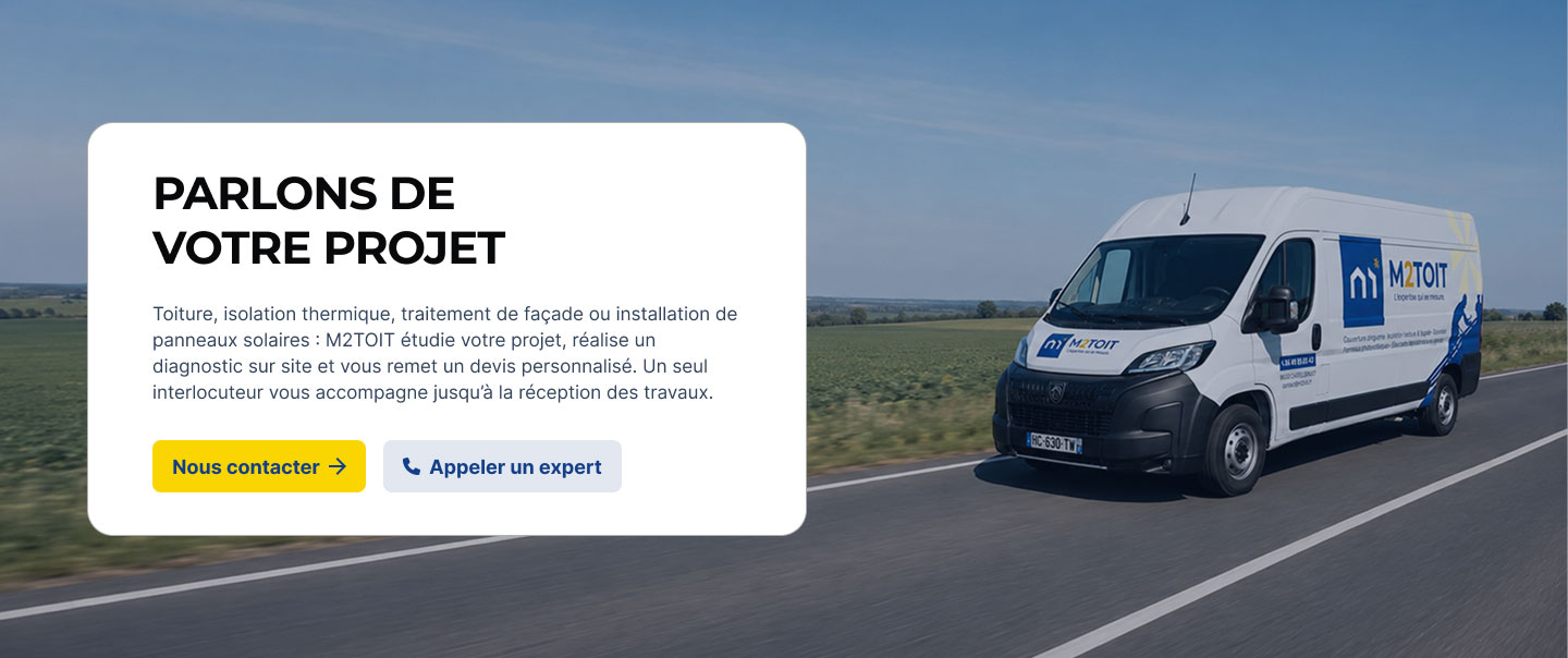
The landing page had been designed from the start as the first step in a broader digital ecosystem. Once the brand identity, art direction, and initial conversion principles were validated, M2TOIT entrusted me with expanding the project into a complete website.
The goal was not to start over, but to turn that first foundation into a system capable of clearly presenting the company’s full range of services while preserving the visual consistency and effectiveness of the original journey.
Structuring a Broader Service Offering
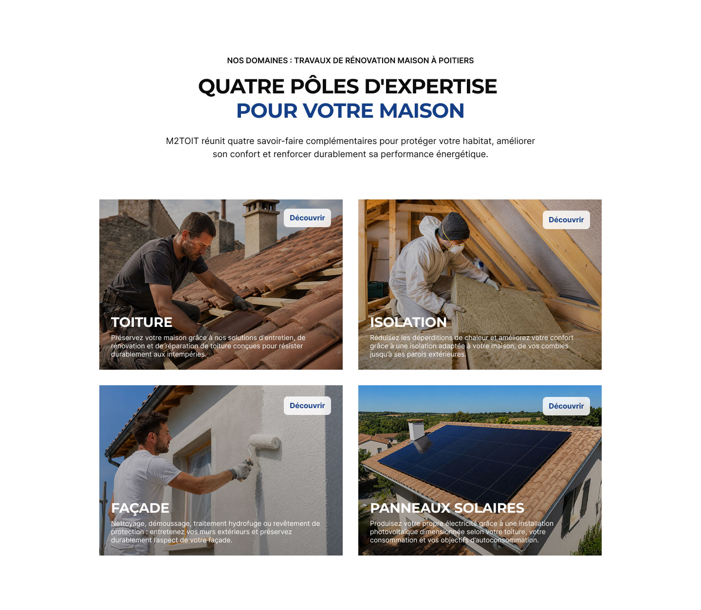
The new website is organized around M2TOIT’s main areas of expertise: roofing, insulation, façades, and solar panels. These service pages are complemented by a more detailed company page, a guide section, and a contact page designed as the convergence point for the different user journeys.
This new architecture means the entire offer no longer has to fit on a single page. Each service now has its own dedicated space, with content tailored to the visitor’s needs and questions.
The UX challenge was to keep navigation simple despite the larger amount of content. The different pages therefore follow a shared logic: quickly identify the need, explain the solution, reinforce trust in M2TOIT’s expertise, and naturally guide the visitor toward requesting a quote or getting in touch.
Extending the Design System Across the Website
The visual language defined during the first phase was expanded across the complete site. The blue, white, and yellow palette, Montserrat and Inter typography, graphic components, and hierarchy principles became the foundation for every new page.
Rather than designing each screen independently, I developed a reusable system of sections and components. This approach creates a consistent experience from one page to another while allowing enough variation to highlight the specific character of each service.
Visual content also plays an important role: project examples, before-and-after comparisons, testimonials, and reassurance elements make the company’s expertise more tangible and help visitors picture the outcome.
A Webflow Build Designed to Evolve
The entire website was developed on Webflow with particular attention to modularity, responsive behavior, and ease of management.
Recurring components, calls to action, reassurance blocks, and content structures were built so the site can evolve without requiring a complete redesign. Lightweight interactions, sliders, before-and-after comparisons, and other interactive elements enrich the experience without distracting from the primary goal.
The finalization phase also covered the essentials required for launch: semantic page structure, metadata, URLs, internal links, alternative text, and consistency across the different paths leading to contact.
The Result: A Complete and Scalable Digital Presence
What began as a landing page created to support a Google Ads campaign has become M2TOIT’s complete digital presence.
The company now has a website capable of clearly presenting its different services, showcasing its expertise and work, and guiding multiple search intents toward the same action: getting in touch with M2TOIT.
The project therefore retains the logic that shaped the original landing page, building trust and making conversion easier, while giving the brand a strong enough structure to support its growth over time.