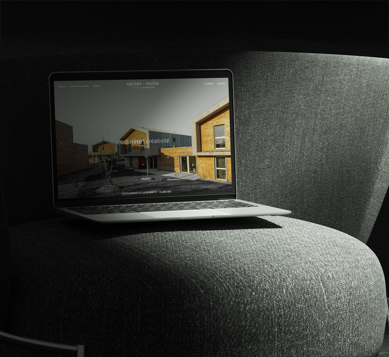
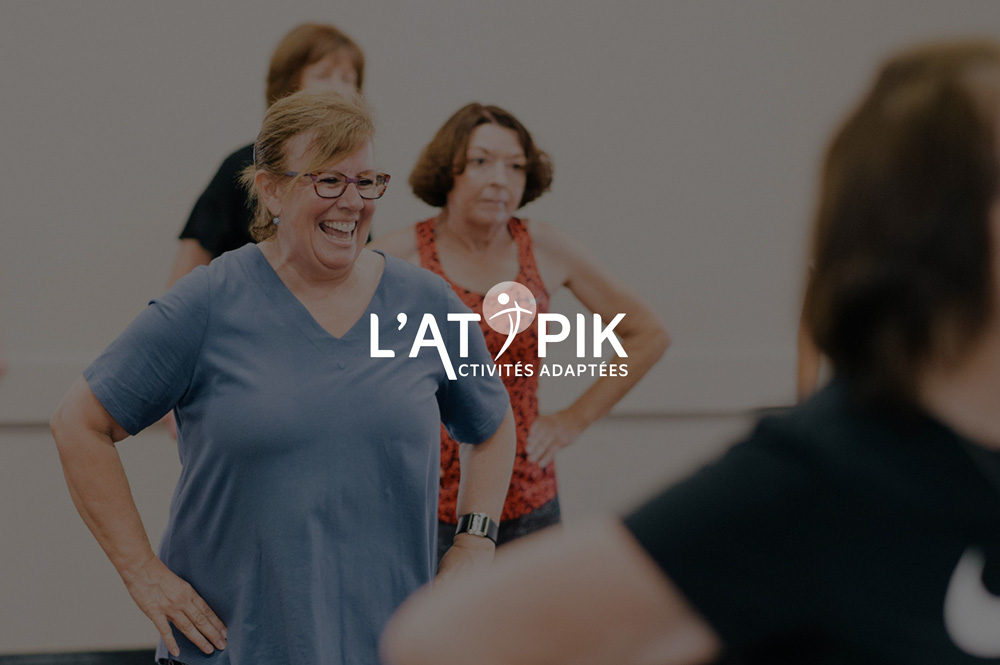
L’Atypik: Webflow website for an adapted fitness centre
Creating a website for an adapted fitness centre means addressing an initial tension: talking about health, medical conditions, and disability without ever becoming patronising or overly sentimental. L’Atypik is not a medical clinic. It is a place where people come to move, make progress, and take care of themselves.
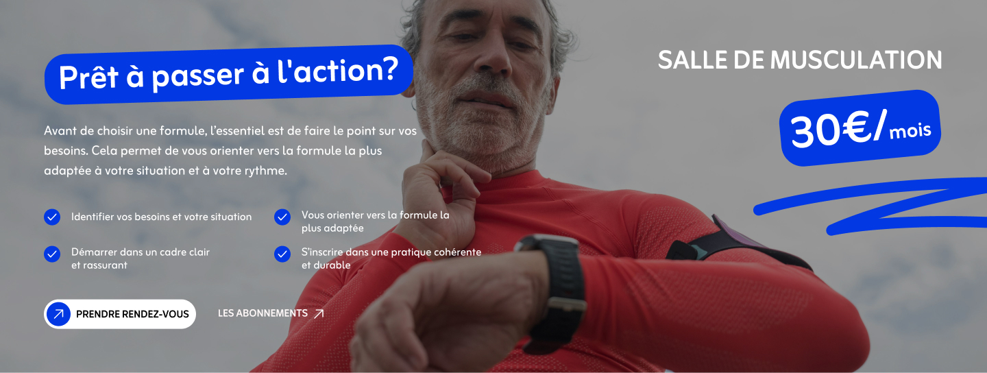
L’Atypik is an Adapted Physical Activity centre, known in France as APA, opening in Châtellerault. It was founded by physiotherapist Kim Garros. Its positioning is clear: a space between a traditional gym and a wellness centre, accessible to the general public, athletes, seniors, and people living with a medical condition.
The challenge was therefore to make adapted physical activity appealing. The website needed to highlight the team’s approachable nature, the diversity of the activities, and the supportive environment, rather than focusing on the difficulties people may face.
The centre had not yet opened, so the website also needed to build trust before the first visitors even walked through the door.
Three core objectives
1. Make the subject feel approachable without being patronising
The tone is warm and adult, with a focus on each person’s independence. No judgement and no pathos, just the desire to move at one’s own pace.
2. Address four audiences within one website
The general public, seniors, people living with medical conditions, and athletes do not have the same expectations or concerns. The website architecture needed to help each audience recognise themselves immediately.
3. Turn interest into appointments
A clear conversion journey was required, from the first click to booking an appointment, with no friction or technical barriers.
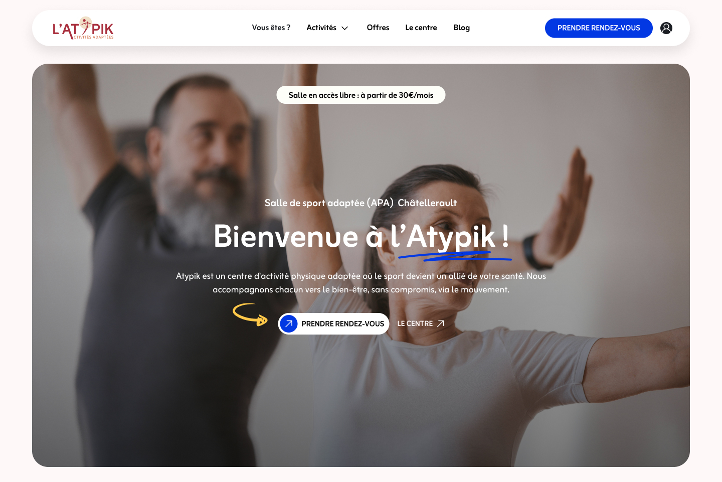
A soft and inclusive art direction
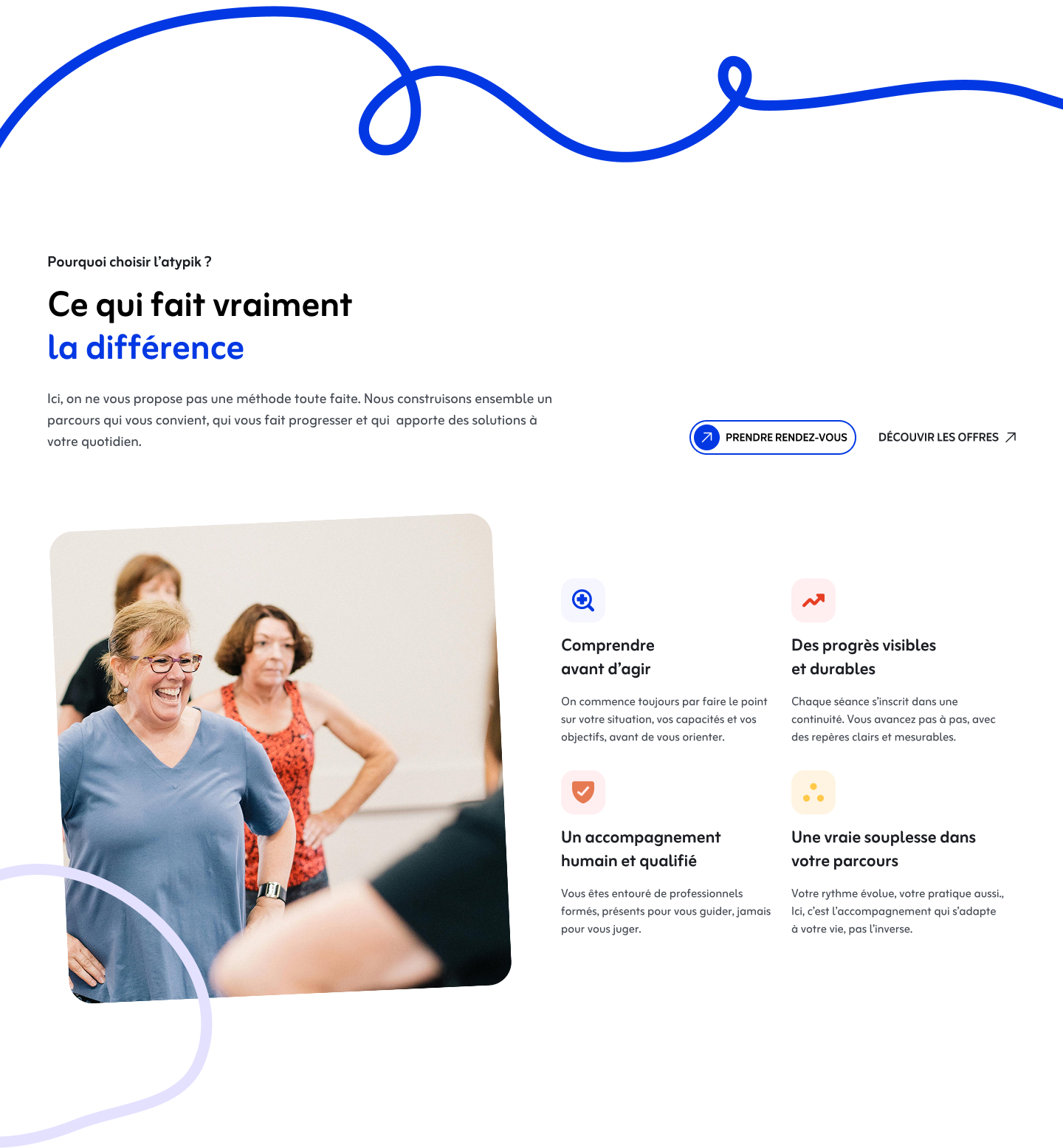
The visual direction is based on a simple idea: adapted physical activity can be joyful.
I developed an art direction that deliberately moves away from the clinical codes commonly associated with the medical sector:
- A bright, colourful palette, far removed from hospital blue
- Rounded and welcoming typography
- Playful, hand-drawn illustrations that bring rhythm to the browsing experience
- Photographs of real participants in motion, never presented as patients
Every visual choice serves the same objective: making visitors feel that they belong here, regardless of their level, age, or personal situation.
Structuring four audiences and five activity categories
The real complexity of the project lay in organising the information. How could four very different profiles be guided without multiplying the number of pages or overwhelming the visitor?
The solution was architectural. The website structure is built around four clear entry points: profiles, under “Who are you?”, activities, memberships, and the centre itself.
The activities were organised into five main categories, each presented according to its objectives and intended audience rather than its limitations:
- Gentle exercise, including Pilates
- Well-being and relaxation, including sophrology
- Balance and coordination, including fall prevention
- Strength and resistance training in a supervised gym
- Cardio training and weight loss, including an original bungee fitness programme
This category-based approach helps both seniors and athletes quickly find the activities relevant to them, while keeping the website clear and easy to navigate.
Two levels of booking: health assessment and member area
The booking journey was designed around two complementary levels, corresponding to two different stages of the relationship.
For first-time visitors, a health assessment form allows them to book an appointment and specify their profile: general public, senior, medical condition, athlete, fitness, or partnership.
This initial filter helps direct each enquiry from the outset and reassures visitors that they will be supported by the right person.
For members, a personal area connected to SimplyBook.me allows them to manage sessions and bookings independently, online and at any time.
The integration was carefully designed so that the transition between the main website and the booking platform remains smooth and visually consistent.
Clear memberships and a reassuring process
The commercial section presents the full range of services transparently, with clear pricing:
- Three membership plans: Essential, Regular, and Unlimited
- Dedicated access to the supervised strength-training gym
- Rechargeable session cards for flexible, commitment-free access
- Recovery options, including drainage and Blueback Physio
To remove any remaining uncertainty, I presented the support process in four stages: initial consultation, health assessment, recommendation of a suitable programme, and progress review.
Visitors know exactly what to expect before making a commitment.
Process: structure before design
Zoning and wireframes
Before beginning any visual exploration, I mapped the journey of each audience to identify the natural progression between discovery, reassurance, and appointment booking.
I then translated the information architecture into page zoning and wireframes, focusing on content hierarchy and reading flow across every page.
Design system in Figma
Once the direction had been approved, I designed the full set of pages and built a design system in Figma, including the typography scale, colour palette, reusable components, and consistent spacing rules.
This ensured visual continuity throughout the website.
Webflow development
The website was developed in Webflow using the Client-First methodology, with particular attention to accessibility: colour contrast, touch-target sizes, and navigation designed for users who may not feel fully comfortable with digital tools.
The entire website is fully responsive, from desktop to mobile.
Booking integration and launch
The final stage involved connecting the health assessment form and the SimplyBook.me member area, testing the complete user journeys, and preparing the website for launch on its final domain following a staging phase.

Result
A Webflow website designed to make people want to visit a centre that had not yet opened:
- A warm tone that makes adapted physical activity feel more approachable
- Four audiences addressed without unnecessary complexity
- Five clear and appealing activity categories
- A two-level booking system, from the first appointment to ongoing member management
- A responsive and accessible foundation, ready for launch
More than a showcase website, it is a genuine acquisition tool designed to turn curiosity into a first session.

.jpg)