A luxury real estate website design for Lusso
Introduction
Designing a website for a luxury property management company means creating a space that communicates before saying a word. Visitors should not need to read a single line to understand the level of service — they should feel it the moment the page loads.
Lusso manages some of the most prestigious private estates in Northern California, across Napa, Sonoma, and the surrounding counties. Their clients are high-net-worth individuals who expect the same standards online as they do in their homes: discretion, precision, and uncompromising quality.
The brief was clear: no noise, no clutter, no shortcuts.
The Challenge: Positioning and Reassurance
From the very first conversations, three priorities quickly emerged.
1. Establish immediate trust and authority
The website needed to position the brand at the same level as the estates it manages: refined, serious, and unmistakably premium.
2. Communicate without overexposing
In the world of private estate management, discretion is a service in itself. The website had to say enough to qualify the right client, while protecting the privacy of existing ones.

Art Direction
I developed an editorial direction built around:
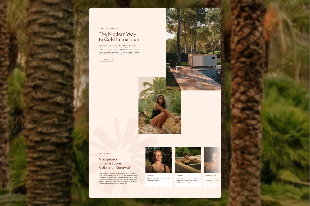
- A warm, desaturated palette inspired by California’s natural materials: limestone, sage, and bleached linen
- Generous spacing to allow each element to breathe
- A refined typographic system, combining a signature-style logotype with clean, architectural serif typefaces
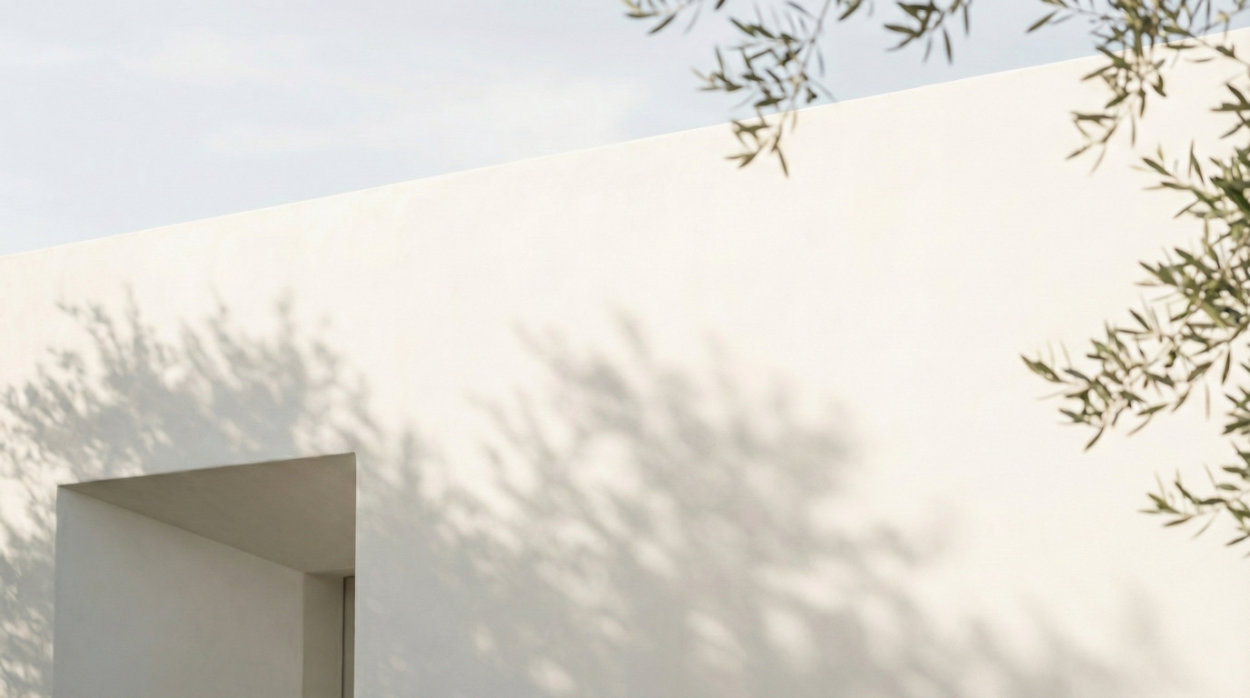
- Photography that evokes the lifestyle these estates enable: light across stone, shadows through foliage, the quiet of a private garden
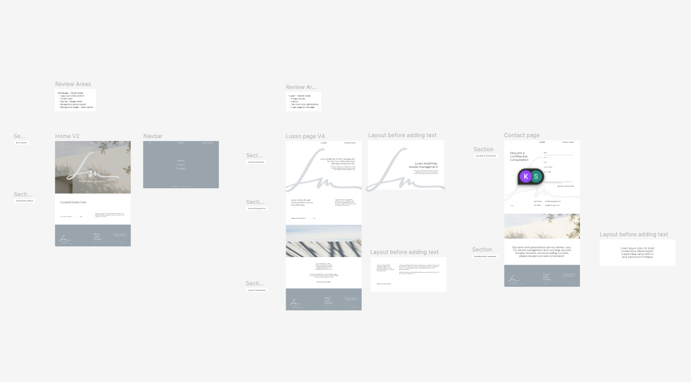
Zoning & Wireframes
I started with structure, not style.
Before exploring any visual direction, I focused on content hierarchy and user flow: what should be felt first, understood second, and acted upon third.
Validating the architecture before the aesthetics ensured a final result that is intuitive, coherent, and impossible to mistake for something generic.
Creative Exploration
Two creative directions were developed to explore different visual interpretations.
The selected direction was then expanded into a complete design system in Figma, including a typographic scale, spacing system, color palette, and a library of reusable components, ensuring visual consistency across the entire site.
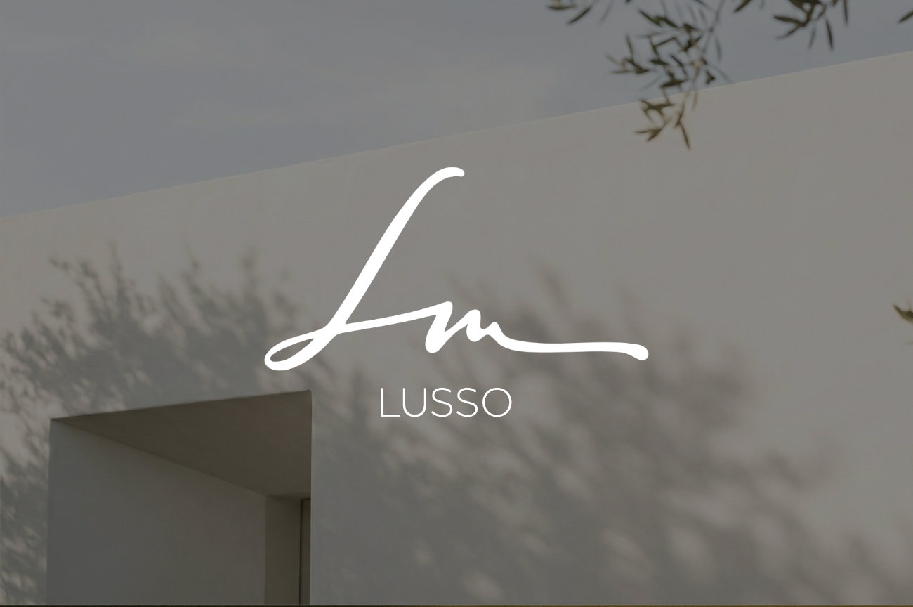
The Lusso logo, a handwritten monogram, anchors the identity throughout the experience. It appears in the hero, the footer, and the contact section, serving both as a brand signature and a structural graphic element.
The choice of imagery was treated as a design decision, not an afterthought. Each photograph was selected for its atmosphere, its light, and its ability to evoke the world Lusso inhabits: discreet, sunlit, and meticulously maintained.
Webflow Development
The website was then developed in Webflow, with a pixel-perfect implementation of the validated designs.
Despite its apparent simplicity, the Lusso website required careful technical attention:
- Smooth, choreographed scroll animations designed to feel natural, never theatrical
- A confidential consultation form with clean validation and messaging emphasizing privacy and secure communication
- Optimized resource loading so the site feels as fast as it is calm
- Direct email links to the two partners (Kent and Leo), preserving the brand’s personal and non-automated approach
The delivery also included a training session, giving the Lusso team full autonomy to manage and evolve their content as the company grows.
Responsive, Performance & Execution Quality
Minimalist design demands flawless execution.
Every breakpoint was tested and refined. The mobile experience is not simply a reduced version of the desktop — it is a thoughtful adaptation. Text scales elegantly, images crop intelligently, and the contact form remains smooth regardless of screen size.
Performance was treated as a design value: fast loading times, no unnecessary scripts, and clean code. For a brand built on seamless service, a slow website would be a contradiction in itself.
Result
A Webflow website designed as a digital property in its own right:
- An identity that communicates authority before a single word is read
- A three-page architecture that guides visitors without pressure
- A contact experience that feels personal, never transactional
- Clean, fast, and fully manageable code
- A design system built to evolve with the company
More than a website — a first impression worthy of the clients Lusso serves.

.jpg)