Bloom Visual Studio: website for a communication agency
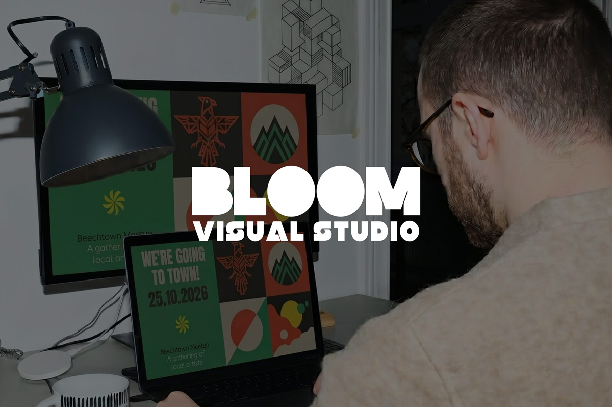
Creating a website for a communication agency presents a unique challenge: the site itself must be the best demonstration of what the agency can achieve for its clients. For Bloom Visual Studio, the goal was to design a digital presence as bold as their positioning: an agency that views communication as an art, treats each client company as a work to be enhanced, and categorically rejects the mediocrity of 'the friend of a friend' solutions. The website had to embody this philosophy from the very first second.
Showcase identity. Provoke. Captivate.
From the outset, three structuring ambitions guided the project:
- Establish a strong and memorable visual identity. A site capable of immediately standing out in a saturated market. No generic templates, no default minimalism: an artistic direction that embraces its singularity.
- Translate the positioning into user experience. Bloom Visual Studio doesn't sell services; they enhance businesses. This nuance had to be felt on every page, with every scroll, and in every animation.
- Build an effective conversion tool. Beyond the visual spectacle, the website needed to generate qualified leads and guide visitors to the services that matched their needs.
A Bold Artistic Direction
The graphic design approach was clear from the start: stand out from the crowd.
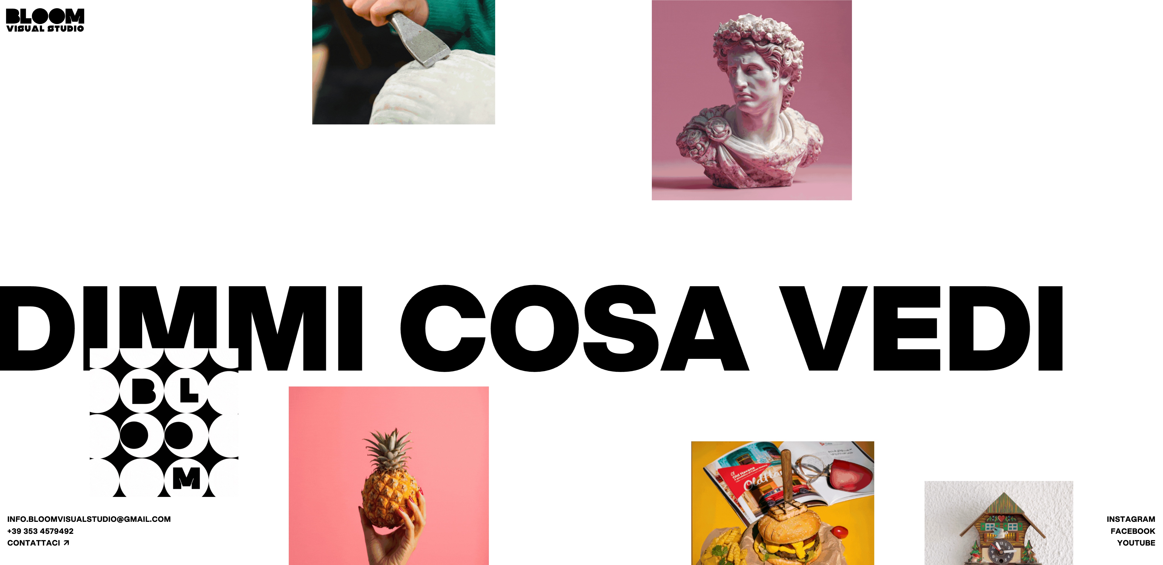
I developed an artistic direction based on strong contrasts and ultra-expressive XXL typography. The name "Bloom Visual Studio" appears full-screen, in massive black typography on a white background, then ochre yellow, the agency's signature color. This first impression is a visual statement: here, we don't whisper, we assert ourselves.
Black and white as the chromatic foundation, yellow as a character accent, typography as an architectural element: these choices create a coherent and recognizable identity that permeates the entire site.
Animations Designed as a Staging
Movement isn't just decoration; it's a statement.
Each animation was custom-designed and developed to support the agency's positioning. The logo enters full-screen, the background shifts from white to ochre yellow, and sections flow seamlessly with transitions that pace the reading without ever interrupting it. No external libraries: everything was built natively in Webflow, ensuring optimal performance and total control over every kinetic detail.
Micro-interactions guide the eye and set the tone even before the visitor has read a single word. This level of attention to movement is precisely what distinguishes a memorable site from one that is merely well-made.
Structuring the Offering Without Diluting the Impact
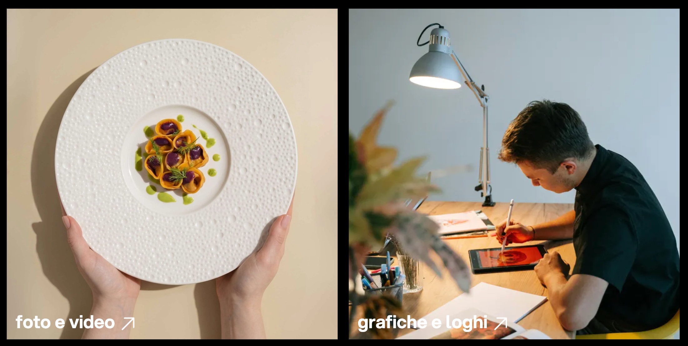
The true complexity of the project lay in the richness of the agency's offering: eight distinct areas of expertise: websites, social media, photo & video, graphic design & logos, advertising campaigns, growth strategies, visual merchandising, training.
How can such a broad offering be presented without creating an overwhelming and confusing experience?
The answer was editorial: present the services as a living catalog, anchored with internal navigation links (#cosa, #siti, #social, #video, etc.) allowing each visitor to directly access what concerns them. The services page was designed as a progressive journey, numbered 01 to 08, where each section develops a precise argument with a hook, a service description, and detailed offerings.
Responsive, Performance & Execution Quality
Such a bold design demands flawless execution across all platforms.
The site was optimized to offer complete consistency across desktop, tablet, and mobile: ensuring the XXL typography remains readable and contrasts don't fade on smaller screens. Each breakpoint received precise adjustments to keep the agency's strong identity intact and impactful, regardless of screen size.
Content and Editorial Tone
Bloom Visual Studio's voice is direct, confident, and slightly provocative. The site's texts were crafted to reflect this positioning: short, affirmative sentences, engaging taglines, and a tone that deliberately stands out from conventional agencies.
The homepage tagline: "La tua azienda è un'opera d'arte. Valorizziamola." perfectly encapsulates this stance. A simple, bold, and immediately differentiating promise. The rotating slogan "Esatto, tutto e niente." in the introduction, followed by the CTA "Ora riproviamo", establishes a dialogue with the visitor upon arrival on the site: here, we think differently.

Result
A Webflow site designed as a brand manifesto: a powerful and memorable visual identity, clear positioning translated into user experience, a structured and accessible service offering, consistent artistic direction from desktop to mobile, a communication tool that embodies what the agency promises its clients.
More than a showcase site, it's a living demonstration of Bloom's approach: every business deserves to be treated as a work of art.

.jpg)