


A professional website for a major architectural portfolio
Designing a website for an architecture studio means creating a digital space that reflects a design mindset, professional rigor, and a clear project vision.
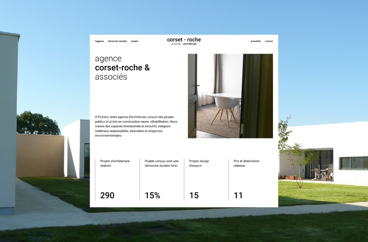
For Corset-Roche & Associés, the goal was to build an online presence that matched the scale of their work: over 200 references to structure, highlight, and make accessible within a clear and coherent framework.
The website was conceived as a true editorial showcase — one that strengthens the agency’s image, organizes its extensive portfolio, and provides a durable communication tool that can be managed independently on a daily basis.
Visibility, Structure, Longevity
From the very beginning, three core ambitions shaped the project:
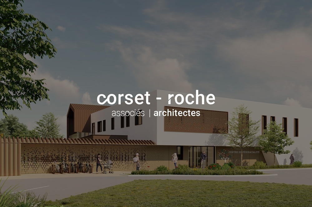
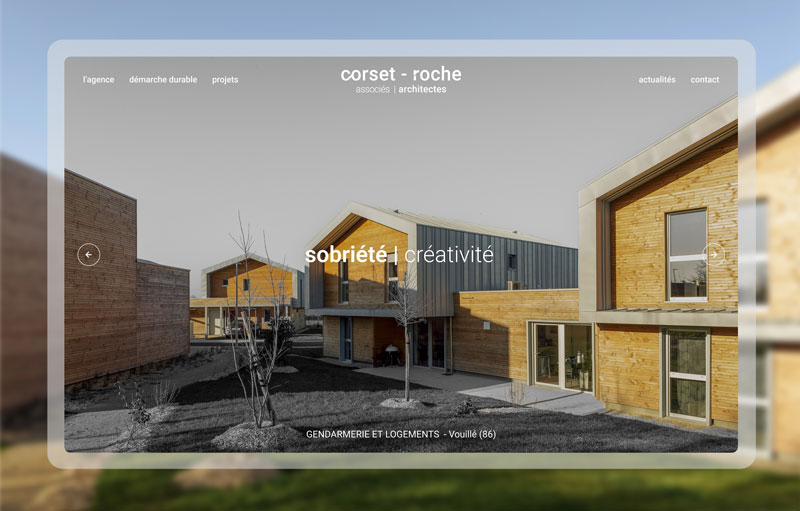
1. A contemporary showcase
A website aligned with the level of the projects themselves, respecting architectural codes: precision, restraint, and mastery.
2. Structure a large volume of references
Transform a massive portfolio into a clear, filterable library that can be understood within seconds.
3. Build a scalable foundation
Enable the agency to publish projects, news, and job openings without technical dependency.
An Editorial and Minimal Art Direction
The visual approach was built around a simple principle:
architecture must remain at the center.
I developed a minimal editorial direction based on:
- clean and structured grids
- refined typography
- clear hierarchy
- generous spacing
Subtle micro-animations enhance the navigation experience. Clean transitions, discreet interactions, and fluid pacing guide the reading flow without ever distracting from the projects themselves.
Structuring 200+ Projects
The true complexity of the project lay in its scale.
How do you make hundreds of projects easily accessible without creating a heavy experience?
The answer was architectural in nature:
treat the portfolio as a system.
- Implementation of a dynamic Projects CMS
- Structured custom fields
- Filtering logic
- Flexible templates capable of adapting to varied content volumes
Each project page is independent yet consistent, maintaining a high level of quality even as content evolves over time.
The same approach was applied to the News and Careers sections, ensuring the website remains dynamic and future-proof.
Process: Structure Before Style
Strategy & Information Architecture
Definition of strategic objectives and structuring of key pages: Agency, Approach, Projects, News, Contact.
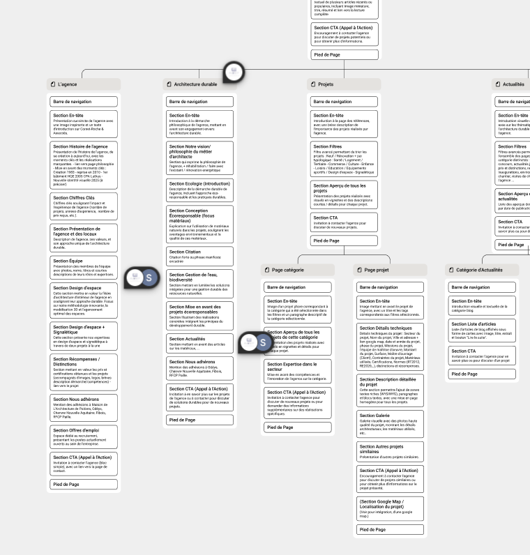
Zoning & Wireframes
We began the project by defining clear strategic objectives and mapping how users should move through the site.
Before designing anything visually, I focused on user flow — identifying the natural progression from discovery to exploration, and ultimately to contact.
I then developed the information architecture and translated it into zoning drafts. At this stage, I worked on content hierarchy, section sequencing, and layout balance to ensure that each page had a clear purpose and supported the overall experience.
During the wireframing phase, I didn’t treat layouts as neutral placeholders. I established the foundations of the future design by shaping an editorial structure: controlled grids, balanced proportions, generous spacing, and a defined reading rhythm.
Even without final typography or visual styling, the wireframes already reflected the intended tone — minimal, structured, and architectural. This allowed the design phase to evolve naturally from a deliberate framework rather than from a blank canvas.
By validating structure before moving into visual design, I ensured the final result was intuitive, scalable, and strategically grounded.
Creative Exploration
Two creative directions were proposed to explore different visual interpretations of the agency’s positioning. The objective was not purely aesthetic, but strategic: to find the right balance between restraint, clarity, and impact.
Once the direction was validated, I rolled out the design across all pages by building a true design system in Figma. Consistent grids, a controlled typographic scale, structured spacing rhythms, and reusable components ensured visual continuity throughout the entire site.
The mockup phase was deeply iterative. Each screen evolved through continuous refinements: adjusting proportions, clarifying block hierarchy, refining alignments, and balancing text with imagery.
Particular care was given to image selection. Visuals were chosen and integrated as structural elements within the layout. Their framing, breathing space, and interaction with typography were carefully considered.
Typography played a central role. Through hierarchy, contrast, and reading rhythm, it reinforced the editorial and architectural character of the project.
Every detail was intentionally crafted to serve clarity, coherence, and precision.
Webflow Development & CMS
The website was developed in Webflow with pixel-perfect precision, translating the approved designs into a structured and scalable digital system.
I built a robust CMS architecture using dynamic fields to structure projects, news, and other key content types. Conditional visibility was implemented to allow flexible layouts that automatically adapt based on available content, ensuring consistency without manual adjustments.
I also personalized the back-office experience for the client's needs, organizing collections and fields in a clear and intuitive way to simplify day-to-day content management.
Finally, I provided training and ongoing guidance to ensure full autonomy. The objective was not only to deliver a finished website, but to equip the agency with a tool they could confidently manage and evolve over time.
Responsive, Performance & Quality
Minimal design demands flawless execution.
Beyond aesthetics, the website was optimized to provide:
- smooth navigation
- fast loading performance
- a bug-free experience
- full consistency across desktop, tablet, and mobile
UX guided every technical decision: reducing friction, clarifying pathways, and delivering a stable, long-term digital experience.

Subtle Animations & Featured Projects
Animation was never conceived as decoration, but as a reading tool.
Soft transitions, controlled appearances, and fluid pacing create movement without distraction. The goal was simple: create flow, never noise.
On the homepage, a featured projects slider highlights strategic works. It shapes the first impression, adds rhythm to the layout, and immediately communicates the quality of the portfolio — all while remaining aligned with the editorial identity.
SEO, Content & Strategic Direction
From the outset, the project integrated a structured SEO approach: clear semantic architecture, coherent heading hierarchy, optimized key content, and project page structuring to support indexing.
Raphaël Seran played a key role in this dimension, contributing strategic SEO direction, copywriting support, and overall project management. His involvement ensured alignment between content and design, clarified positioning, and reinforced editorial consistency throughout the site.
Result
A Webflow website designed as a true editorial showcase:
- a clear and contemporary identity
- a large-scale portfolio made simple to explore
- a robust and autonomous CMS foundation
- a smooth and controlled user experience
- a scalable structure built to evolve over time
More than a website, it is a digital framework capable of supporting the agency’s continued growth.

.jpg)


