Figma: Benefits, Drawbacks and Why Use It in 2026

Figma has become one of the standard tools for interface design, but its value is no longer limited to creating a mockup. In 2026, it can structure an experience, support a design system, prototype user flows, centralise client feedback and, through products such as Figma Sites, Make and MCP, move parts of the workflow closer to production.
If you are asking why use Figma, its biggest advantages are collaboration, flexible components, Auto Layout, variables and prototyping. But it also has limitations: poorly organised files become difficult to maintain, advanced features require a method, and a Figma mockup alone does not guarantee a fast, accessible or search-friendly website.
This guide takes a more useful approach than simply saying that Figma is a great tool: what it does well, where it falls short and how I use it in real website projects.
What is Figma in 2026?
Figma is still primarily a collaborative interface design platform. Designers use frames, components, variants, styles, variables, prototypes and shared libraries to turn a visual direction into a reusable system.
The ecosystem is now much broader. Figma Sites can design and publish responsive websites within the Figma workflow. Figma Make brings visual editing closer to code with AI-assisted workflows. Figma’s MCP server gives coding agents structured design context.
So Figma is no longer only the place where a team draws what a website should eventually become. It now covers a wider part of the path from idea to prototype and, in some cases, production.
The 8 main benefits of Figma
1. Real-time collaboration that is actually useful
Multiple people can work in the same file, comment on a specific screen and follow changes without emailing new versions back and forth. For client work, this matters: feedback stays attached to the interface being discussed and approval becomes much more visual.
2. A cloud environment that is easy to share
A single link can be used to present a mockup or prototype. The file stays centralised, and designers, clients, developers and other stakeholders work from the same version.
3. Auto Layout makes interfaces more robust
Auto Layout helps build elements that respond to content: buttons can grow with their labels, cards can adapt to longer copy and groups can maintain consistent spacing. It is not web responsiveness by itself, but it encourages designers to think in systems rather than fixed screenshots.
4. Components reduce repetitive design work
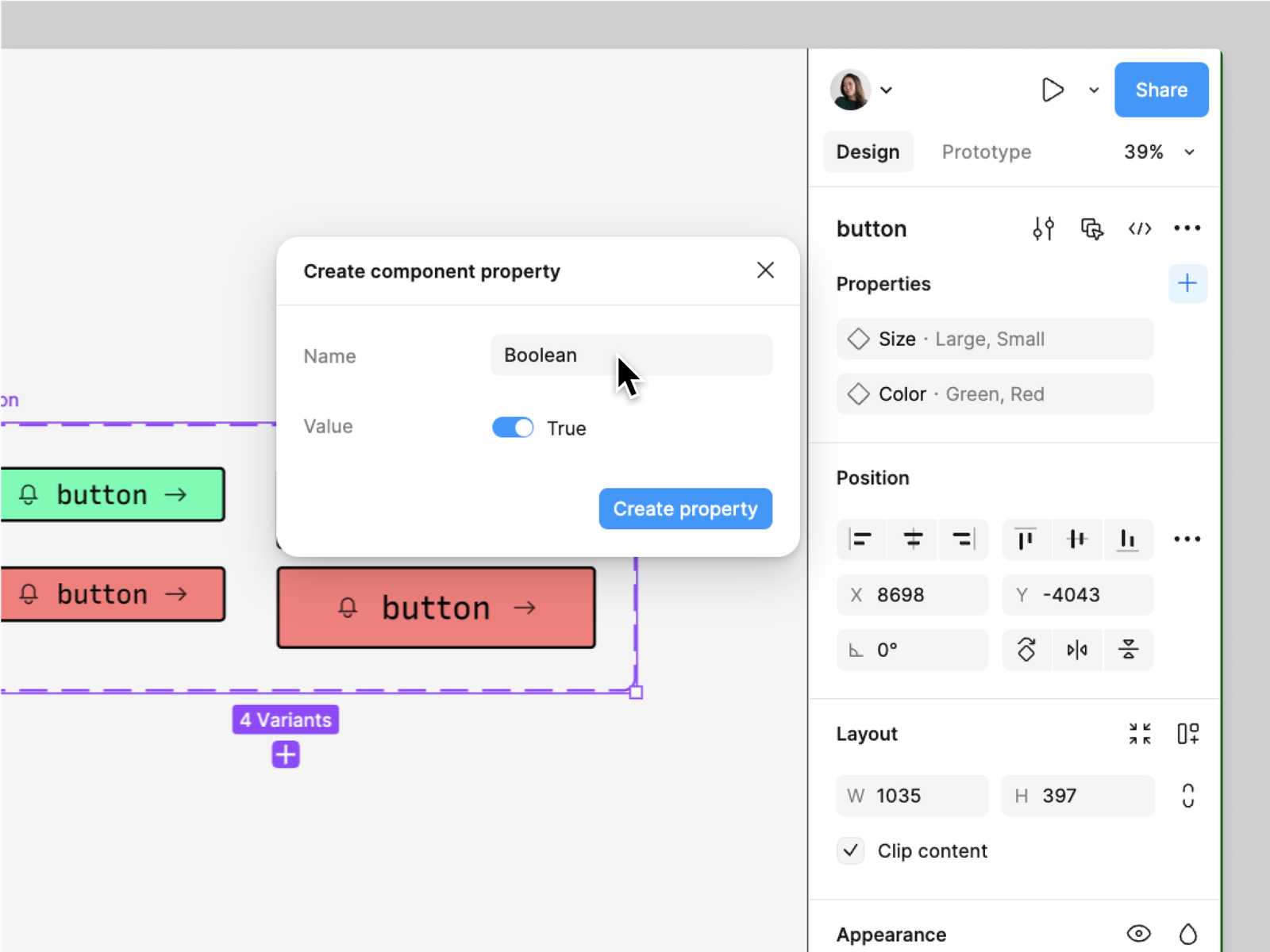
Navigation, buttons, forms, cards and editorial patterns can become reusable components with variants. Updating the source component can then update its instances across the file. On a multi-page website, this makes consistency much easier to maintain.
5. Variables strengthen design systems
Colours, spacing, values and modes can be centralised instead of being recreated locally. This makes the system easier to evolve and gives developers clearer rules when the project moves into production.
6. Prototyping lets teams test before building
Figma can connect screens, simulate interactions and share clickable flows. For websites, this is useful for validating navigation, menus, onboarding, multi-step journeys or key interactions before development time is committed.
7. Developer handoff is clearer
Dimensions, spacing, typography, colours and component information are inspectable. Dev Mode and newer workflows such as MCP add more context around the intent and systems behind the design.
8. The ecosystem now goes well beyond mockups
Plugins, widgets, FigJam, Slides, Sites, Make, Dev Mode and AI workflows make Figma a broad ecosystem. That is useful as long as the team remembers that more features do not replace good UX decisions.
The limitations and drawbacks of Figma
A useful pros-and-cons article also needs to explain what Figma does not solve.
Large files can become difficult to manage
Dozens of pages, thousands of layers, duplicated components and heavy images can make a project harder to navigate. Naming conventions, well-managed libraries and regular clean-up become important as the file grows.
Advanced features have a learning curve
Drawing a frame and adding text is easy. Building a coherent system with nested Auto Layout, variables, component properties, variants and modes takes much more practice. Figma is accessible, but mastering it is not instant.
A badly structured design system can create friction
Components and variables are only useful when their logic is understandable. Too many variants, inconsistent naming or overly specific components can make a system harder to use than a simpler file.
A mockup is not a production website
A design can look perfect in a frame and fail when it meets real content, intermediate screen widths, CMS data or accessibility requirements. A production build should translate design intent into a flexible system rather than hard-code a screenshot.
Team costs depend on how far you use the ecosystem
Figma is easy to adopt for an individual or small project. Once an organisation needs advanced features, many seats or intensive AI usage, the cost of the ecosystem becomes something to evaluate alongside other tools.
Why use Figma to design a website?
The biggest reason is simple: solve expensive decisions before development.
Reordering sections, testing two visual directions or challenging a navigation structure takes far less time in a design file than in a finished build. Figma also makes it possible to validate real copy, page rhythm, interface states and mobile logic before those decisions become technical.
For a client, that creates a concrete preview of the future website. For the designer and developer, it creates a shared reference. For the project, it reduces the number of UX decisions that have to be improvised during implementation.
My workflow: zoning, wireframes, UI design and prototypes
I do not start a Figma file with colours. A strong interface comes after the information has been structured.
1. Zoning
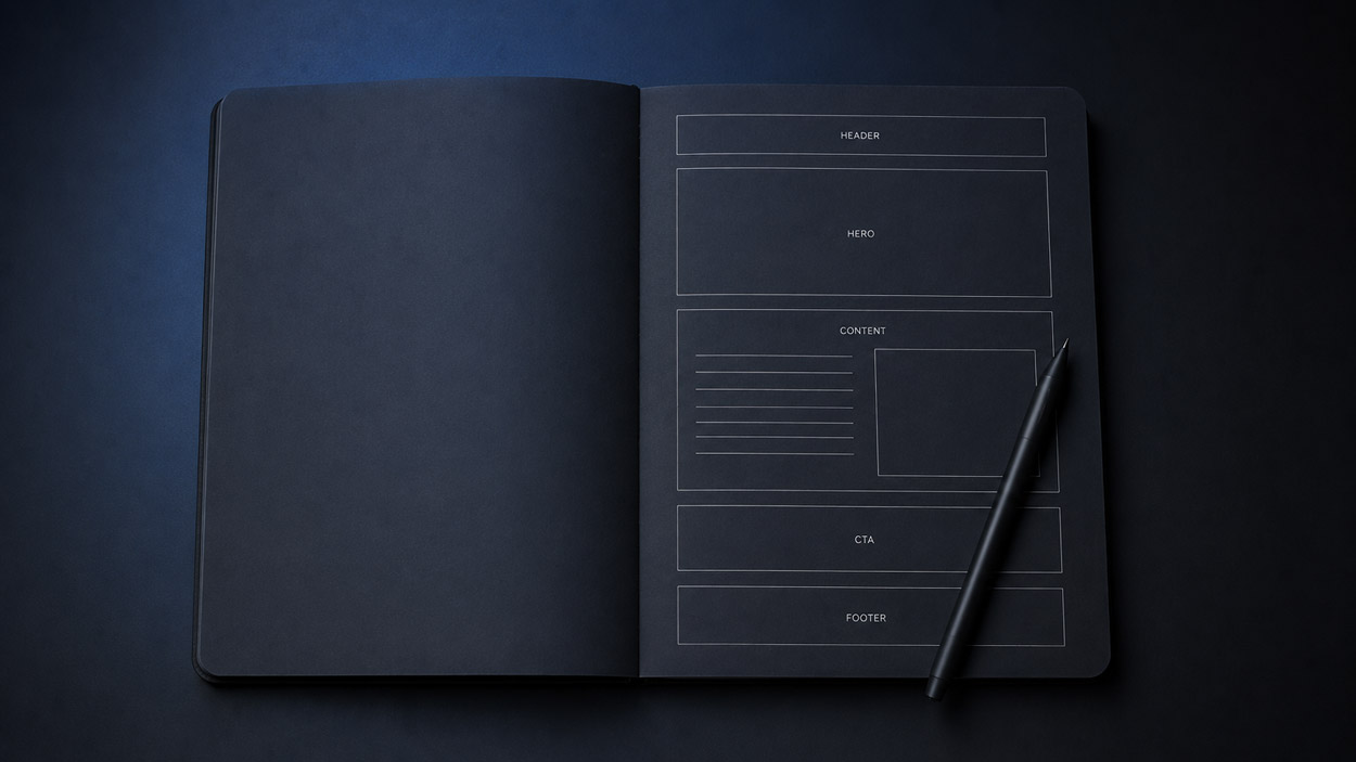
I first define the major areas of the page, their order and their purpose. The goal is to validate hierarchy before visual styling. I explain this approach in more depth in my UX zoning guide.
2. Wireframes
The wireframe gives the structure more detail: content, navigation, calls to action, repeated patterns, dynamic blocks and user paths. Black and white is often useful here because it prevents visual styling from hiding an information problem.
3. High-fidelity UI design
Once the structure is sound, I add typography, colour, imagery, grids, components and design-system rules. Real content is used whenever possible so the interface is not designed around unrealistic placeholder copy.
4. Prototype and approval
Important interactions are simulated when they help clarify the experience: menus, journeys, sliders, state changes or navigation between screens. The goal is not to prototype every hover, but to remove ambiguity before development.
Figma in 2026: Sites, Make and workflows closer to code
This is the part of Figma that has changed the most.
Figma Sites: from design to a published responsive website
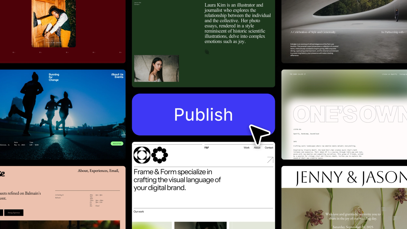
Figma Sites can design, preview and publish responsive websites within the same ecosystem. Figma says its website preview is rendered in HTML and CSS and can be resized to inspect how the layout reflows before publishing.
For a portfolio, landing page or highly visual experience, that clearly shortens the distance between design and launch.
Figma Make: visually editing code
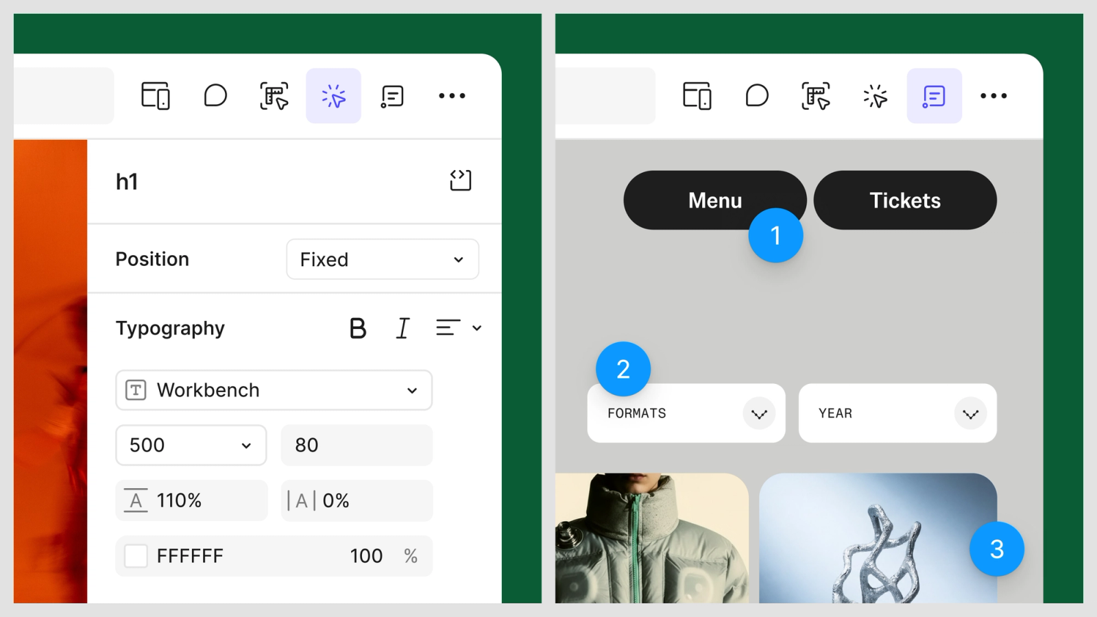
In July 2026, Figma added a properties panel and annotations to Make. Designers can select an element, adjust properties such as spacing, typography or layout visually, then use contextual annotations to guide the agent on interactions and behaviour.
This type of workflow further reduces the distance between designing and building, but it still does not remove the need to control code quality, product logic and the constraints of the final environment.
Figma MCP: bringing design context into coding agents
Figma’s MCP server can provide an agent with information about components, variables, styles and screenshots from the design. The goal is not to automatically reproduce a frame pixel by pixel, but to give the model more context about the design intent and system used in the file.
This is one of the most interesting developments in the workflow: AI becomes more useful when it understands the project system, not just the pixels in a screenshot.
Can Figma replace Webflow or web development?
The answer is less binary than it used to be.
With Figma Sites, some simple or highly visual websites can now be designed and published without leaving the ecosystem. That is a meaningful change. The right choice still depends on the project requirements.
A professional website may also need a structured CMS, relationships between content types, advanced SEO, redirects, business integrations, complex forms, automation, accessibility requirements, performance monitoring and long-term maintenance.
In those cases, I still separate interface design from the production stack. For Webflow projects, the approved Figma file becomes the design reference, while the build translates it into responsive structure, reusable components, CMS architecture and production behaviour.
If that is the stage you are at, my dedicated guide explains how I turn a Figma design into a production Webflow website. You can also explore my UX/UI design service.
Is Figma the right tool for your project?
For most custom website projects, yes, particularly when multiple screens need to be structured or a direction needs to be approved before development.
- Custom marketing website: very well suited to UX, UI and approval.
- Design system: very strong because of components, variables and shared libraries.
- Product prototype: useful for testing flows and gathering feedback.
- Client collaboration: one of Figma’s strongest advantages.
- Simple published website: Figma Sites can now cover some of these needs.
- Complex CMS, advanced SEO or many integrations: the production architecture still needs to be considered separately.
The important question is not whether Figma is popular. It is what problem it solves in your workflow.
In my projects, Figma is mainly where we make better decisions before development: architecture, interface, components, responsive behaviour and approval. If you have a website project to structure or redesign, send me the brief and I can review it.
FAQ
What are the main benefits of Figma?
Figma combines interface design, real-time collaboration, Auto Layout, components, variables, design systems and prototyping in one cloud-based environment. It also makes sharing, commenting and client or team approval much easier because everyone can work from the same file.
What are the disadvantages of Figma?
Large and poorly organised files can become heavy, advanced features require a real learning curve, and components or variables only help when the design system is well structured. A Figma mockup is also not automatically a production-ready website with CMS, SEO, performance and integrations.
Why use Figma to design a website?
Figma lets a team solve information hierarchy, page structure, UI and key behaviours before development. Changes are faster and cheaper at this stage, and clients can validate the direction visually before the website is built.
Can Figma create and publish a website?
Yes. Figma Sites can now be used to design, preview and publish responsive websites from the Figma ecosystem. That does not automatically make it the right production platform for every project, especially when advanced CMS, SEO, integrations or long-term maintenance are required.
What is the difference between Figma and Webflow?
Figma is primarily a design, prototyping and collaboration environment. Webflow is a production web platform with CMS, hosting and live website logic. Figma Sites has narrowed part of that gap, but the tools still serve different needs depending on project complexity.