The benefits of responsive design: An optimal user experience

Responsive design is no longer an optional layer added at the end of a website project. It is the baseline for creating an experience that remains clear, usable and credible across phones, tablets, laptops and larger screens.
A responsive website does more than resize itself. It adapts hierarchy, spacing, typography, navigation and interactions to the context in which the page is being used. Done properly, this improves UX, supports SEO and makes the website easier to maintain over time.
So what does responsive design actually change, and why does it matter so much for a professional website?
What is responsive design?
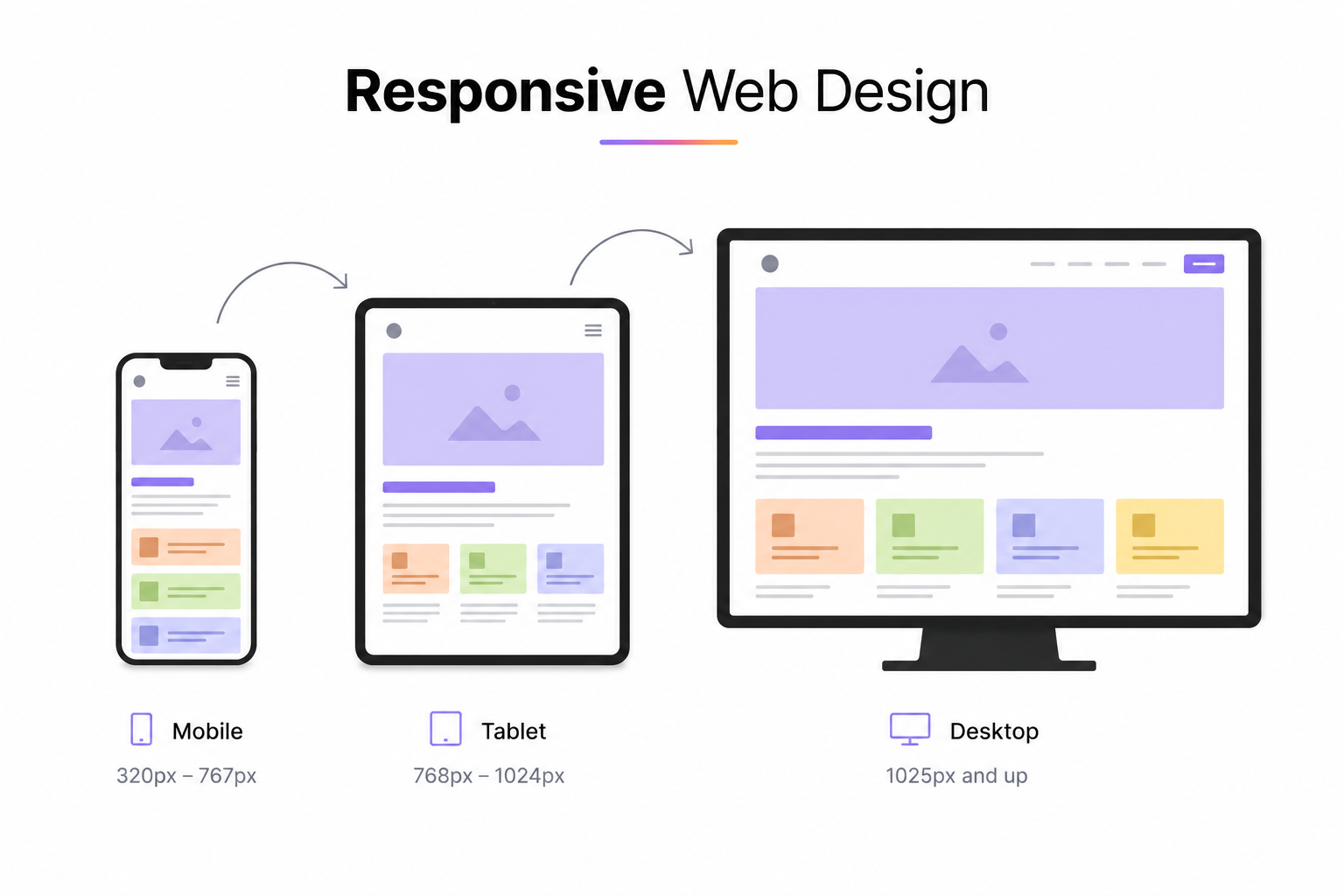
Responsive design is an approach in which a website adapts its layout to different screen sizes without requiring a separate mobile version. Elements can resize, wrap, stack, move or disappear depending on the available space and the importance of the content.
Technically, responsive interfaces rely on flexible layouts, scalable media and CSS breakpoints. But the real work is not simply technical. A strong responsive experience also requires decisions about what should remain visible, what deserves priority and how interaction patterns change on smaller screens.
1. A better user experience across devices
A poorly adapted website creates friction immediately: text becomes difficult to read, buttons are too small, navigation feels cramped and layouts overflow horizontally. On mobile, even small issues become very visible.
Responsive design removes this friction by adapting the experience to the device rather than forcing every screen to behave like a smaller desktop. Navigation, forms, buttons, imagery and content hierarchy can all be adjusted to remain comfortable to use.
This is also why responsive design is closely connected to UX design. The objective is not simply to make every block fit, but to preserve the logic of the user journey at each breakpoint.
2. Responsive design supports SEO
Google uses the mobile version of a page for indexing, so the mobile experience cannot be treated as secondary. Important content, links and structured information should remain accessible on smaller screens.
A responsive implementation also avoids the complexity of maintaining separate desktop and mobile URLs. Instead, each page keeps one URL and one content structure that adapts visually across devices.
Responsive design is only one part of technical SEO, but it works alongside performance, crawlability, internal linking and content structure. I cover those broader principles in my guide to Webflow SEO and AI search visibility.
Core Web Vitals matter here as well. The current metrics focus on loading performance, responsiveness and visual stability through LCP, INP and CLS. Responsive decisions such as image sizing, animation complexity and layout stability can directly influence those metrics.
3. One website is easier to maintain
Managing separate desktop and mobile versions creates unnecessary complexity. Content updates need to be duplicated, fixes have to be tested twice and inconsistencies appear more easily over time.
A responsive website uses one structure that adapts across contexts. This makes ongoing improvements easier because changes can be made once and then refined per breakpoint only when necessary.
For an existing Webflow site, this also means many responsive issues can often be corrected without rebuilding the entire project. A focused Webflow maintenance and support intervention can address overflow, spacing, typography, navigation and breakpoint problems while preserving the existing design system.
4. Better mobile experiences support conversion
Responsive design has a direct commercial impact because many conversion problems are simply usability problems in disguise. A form that is uncomfortable to complete, a CTA that disappears below the fold or a navigation menu that is difficult to use can all reduce the number of people who complete the intended action.
On mobile, the interface usually needs more than smaller dimensions. It often benefits from shorter content blocks, clearer priorities, larger touch targets and a more direct path to the primary action.
For a landing page, business website or e-commerce experience, these adjustments can make the difference between a visitor who understands what to do next and one who leaves.
5. A responsive system is more durable
A good responsive system is not designed for a list of specific devices. It is designed around content and available space. That makes it more resilient as screen sizes evolve.
Instead of asking whether a page works on one particular phone, the better question is whether the layout remains coherent as the viewport becomes progressively narrower or wider. This mindset leads to fewer fragile fixes and a more scalable design system.
Responsive design and Webflow
Webflow gives precise visual control over responsive behavior through breakpoints and cascading styles. Layout, spacing, typography, visibility and positioning can all be adjusted directly in the Designer while preserving a shared structure.
This makes Webflow particularly effective when responsive behavior is considered from the beginning rather than fixed at the end. In my Webflow development work, desktop and mobile are treated as parts of the same system: the goal is consistency, not simply visual similarity.
The important point is that Webflow does not make a website responsive automatically. The tool provides the controls, but the quality still depends on how the layout, classes, assets and interactions are designed.
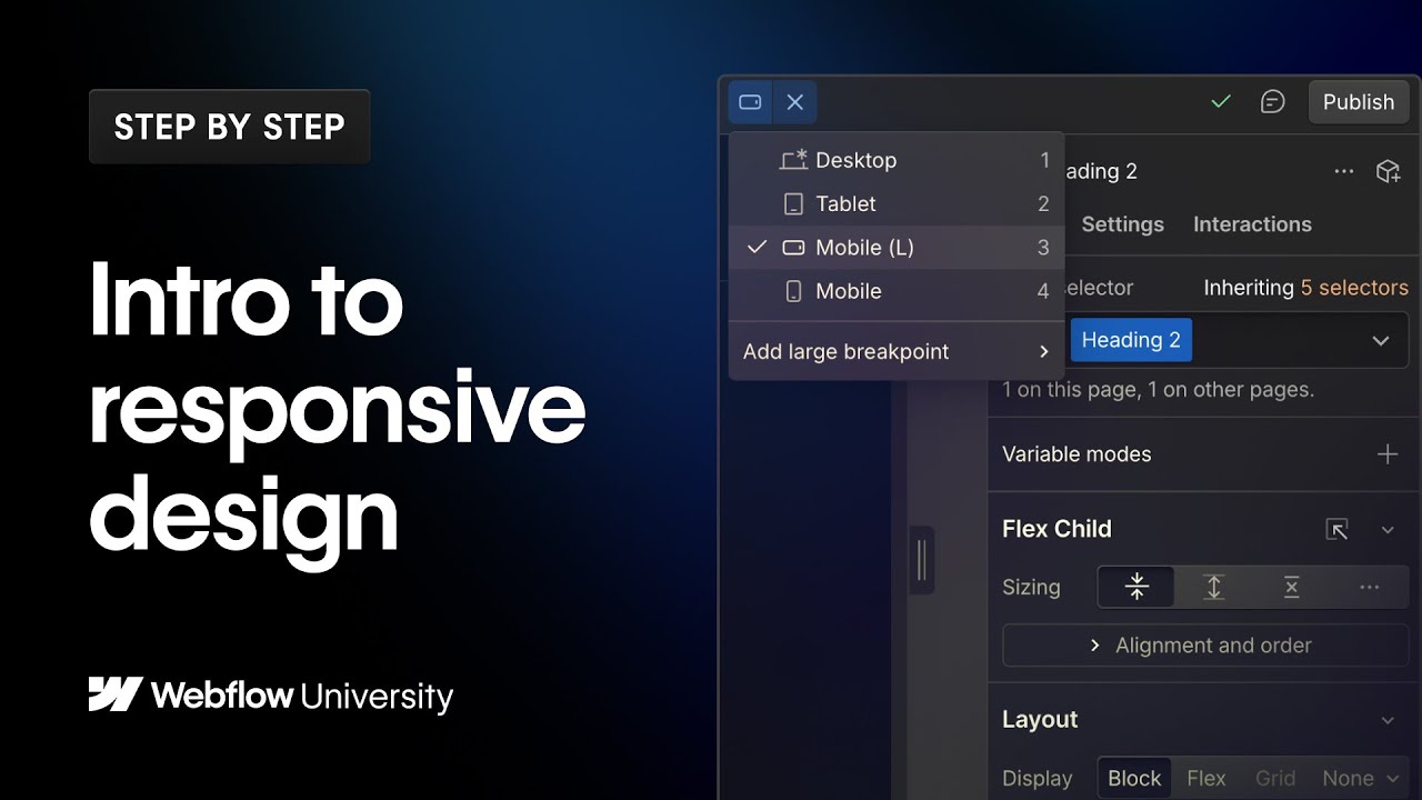
Webflow University has a useful introduction to breakpoints, style inheritance and responsive behavior.
Watch the Webflow University video →
In summary
Responsive design improves more than appearance. It makes a website easier to use, easier to maintain and better prepared for mobile-first indexing and modern performance requirements.
The strongest implementations start with content hierarchy and user needs, then use breakpoints to adapt the interface without fragmenting it into separate experiences.
If an existing site has mobile or breakpoint issues, I can review the structure and identify what can be fixed without a full redesign. Explore my Webflow maintenance service or get in touch.
FAQ
What is responsive design and why does it matter in 2026?
Responsive design is an approach that lets a website adapt its layout, typography, navigation and media to different screen sizes. It matters because mobile content is used for Google indexing and because users expect the same clarity and usability across phones, tablets and larger screens.
What is the difference between responsive and adaptive design?
Responsive design uses flexible layouts and breakpoint rules so the interface can continuously adapt to available space. Adaptive design relies more heavily on a set of predefined layouts for specific screen ranges. Responsive systems are generally more flexible for modern websites with many viewport sizes.
How does Webflow handle responsive design?
Webflow uses cascading styles and breakpoints to control layout, spacing, typography, visibility and positioning across screen sizes. The Designer provides the tools, but responsive quality still depends on how the site structure, classes, media and interactions are implemented.
Does responsive design affect performance and Core Web Vitals?
Yes. Responsive choices such as image sizing, layout stability, animation complexity and JavaScript usage can influence loading performance and interaction quality. A well-built responsive site should support strong LCP, INP and CLS results rather than simply resize the desktop interface.
Can an existing Webflow site be made responsive without rebuilding it?
Often, yes. Existing Webflow sites can frequently be improved by fixing overflow, spacing, typography, navigation and breakpoint inheritance without starting again from scratch. The amount of work depends on the quality of the existing class structure and design system.